Our Ultimate Guide to Maximizing Commercial Bathroom Space
Bathroom design is an essential yet often overlooked issue for commercial construction. For smaller companies moving into pre-existing buildings or businesses that have limited room, maximizing commercial bathroom space can be challenging.
That’s why we’re creating the ultimate guide to designing a small commercial bathroom. Small commercial restroom design offers some unique challenges, and addressing them will impact your overall architecture and building plan. If you’re in the process of designing a small commercial restroom, we are here to give you a run-down of our favorite solutions.
Why A Commercial Bathroom Is Important
Before we get to some of our favorite tips for a small commercial restroom, it’s important to realize that a nice bathroom is crucial for business, whether those restrooms will be used for customers, employees or both.
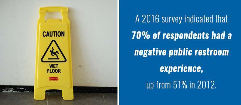
Consider these statistics from CleanLink, a resource for the public cleaning industry. In a 2016 survey, 70% of respondents indicated they had had a negative public restroom experience, up from 51% in 2012. In the same survey, only 50% of employees felt the restrooms available at their workplace were excellent or very good, down from 66% in 2012.
Furthermore, the fifth most common response was that an unfortunate restroom experience tarnishes the reputation of the business where it is located. So, whether you are installing a public restroom for use by your customers or you are installing new employee restrooms, your work will be noticed. In fact, bathroom design is an important component of business success.
How to Make a Commercial Bathroom Feel Bigger
Now that you understand how important small commercial restroom design is, we want to present you with some of our top tips for maximizing commercial restroom space:
1. Proper Mirror Placement
One approach to small commercial restroom design is to make the restroom appear bigger than it actually is. There are many great ways to accomplish this goal. Start by installing lots of mirrors. This will give the impression that there is a lot more space in the room. It has the added benefit of being convenient for your customers and employees.
Because people who use public restrooms want to avoid the embarrassment of emerging with clothes disheveled or may be using the facility to touch up makeup or straighten their tie, lots of mirrors make it easy to check their reflection without forcing strangers or casual acquaintances into jockeying for position in front of the only reflection.
While couples may be comfortable doing this at home, it is a lot less comfortable at work or while shopping. Mirrors that are installed opposite each other are especially effective, as they create the illusion of infinite space as they reflect back on each other. During installation, make sure the mirrors are flush against the wall. Ornate frames or thick mirrors will work against this expansive visual effect.
2. Reflective Surfaces
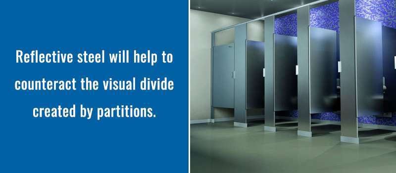
Stalls are an important feature in public restrooms. They provide privacy for people, but they also break up space and can make a bathroom feel cramped. One way to solve this concern is to install stalls with reflective surfaces.
Reflective steel will help to counteract the visual divide created by partitions. High gloss colored finishes can accomplish the same goal and have the added benefit of coming in a wide range of color options, giving your design increased versatility.
This same effect can be created through the installation of reflective steel counters and sinks. You can even install reflective flooring. A high shine tile floor is a great option. Luckily, steel has become increasingly chic within the world of interior design, so not only will you be creating visual space in your small business restroom, but you will also add a sense of style to your architecture.
3. Leave Space Under Sinks
A lot of sink designs hide the plumbing underneath them within cabinet structures. While this may give the bathroom clean lines, it can also make the hand-washing area feel crowded. By exposing this area, you create visual space even if most people aren’t using it. Use sinks that are installed directly into the wall or a row of sinks installed within a free-standing counter.
However, be sure you don’t leave the space underneath the sinks messy. Make sure you are as mindful of the visual effects of the plumbing underneath the sink as you are about the faucet hardware above.
4. Embrace Natural Light
Natural light makes a small commercial bathroom appear more spacious. However, inviting natural light in must be done judiciously. People using public restrooms expect a level of privacy and are likely to be less comfortable with clear windows than they would be at home.
One trick is to install windows that are located high, near the ceiling. You can also use frosted or opaque glass to let in light without giving anyone outside a view into the bathroom. If you are on the top floor, a commercial skylight might also be a great option. That said, natural light isn’t worth making people uncomfortable. Most people prefer a small space over lack of privacy.
5. Employ Soft Colors
Soft colors reflect light, while dark colors absorb it. Soft colors will, therefore, make the bathroom appear larger. That doesn’t mean you can’t be creative with your color scheme. If you put soft colors on the wall, you can contrast the walls with darker colored fixtures and accessories. This will enhance the effect of the soft-colored walls.
Further, there is still a wide-ranging design palette available among soft colors. If you are looking to bring specific colors or tones into your bathroom interior design, simply pick more muted varieties.
6. Consider Recessed Lighting
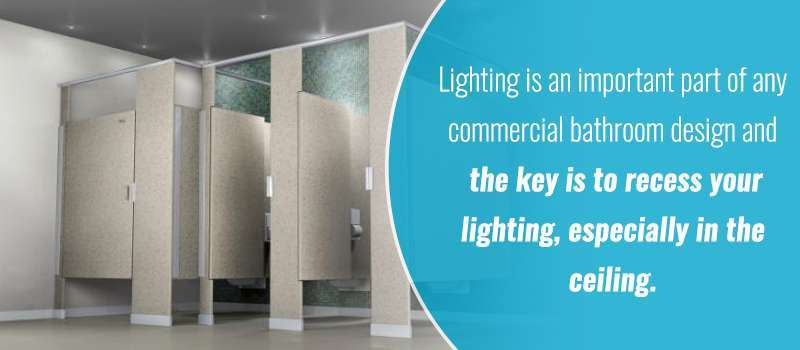
Lighting is an important part of any commercial bathroom design. However, the way lighting is installed can have a big influence on whether space feels cramped or spacious. The key is to recess your lighting, especially in the ceiling. Lighting fixtures that not recessed intrude on the precious space available.
Physical lighting fixtures visually weigh down ceilings and pull walls inward. By recessing your lighting, you will leave walls and ceiling feeling unobtrusive. As you select your lighting, be mindful of how much you are using and the types of bulbs you are installing. One of the consequences of lighting overkill is excess heat.
If you have too many bulbs generating heat, you will either need to increase energy expenditures to properly cool the room, or you will make your customers or employees uncomfortable. By only installing as much lighting as you need, you avoid having to make this lose-lose decision.
7. Install Crown Molding
Crown molding is a small touch that can visually heighten your space. It creates the effect of a higher ceiling. Don’t use too large of a crown molding, as this will then crowd the space and actually have the opposite effect on your bathroom. Crown molding has the added benefit of adding a touch of luxury to your restroom.
Depending on where you are installing it, this could be a great way to make a positive impression on your guests. It will ensure your bathroom doesn’t come across as overly institutional.
8. Use Art With Caution
For those who want to make their commercial restrooms feel more like home, it can be tempting to use wall art, but when it comes to small commercial restrooms, this could be counterproductive. Instead of making your restroom more inviting, wall art may come across as obtrusive.
Instead, find ways to make walls appear intentionally designed without hanging anything on them. Vinyl decals are a great compromise, as they add an artistic touch without taking up any additional space.
9. Use Slim-Line Trashcans
Generally, you want to do what you can to keep objects out of the way in a small commercial bathroom. Trashcans are one of the most common freestanding objects in a commercial bathroom. Luckily, there are trashcan designs that are more space-friendly. We recommend a slim-line, wall-mounted trashcan. This will help to open-up space.
Considering that trashcans are usually placed near the exit, this is an especially good option if your bathroom has a tight entrance. Even if you have created an open bathroom, a tight entrance will make a first impression on customers, establishing your bathroom as being cramped.
10. Put Storage Outside the Bathroom
If space is precious, you don’t want to waste any of it on a storage closet. If you need to place a janitor’s closet near the bathroom, try to find a different place for it. Plus, you typically only need one janitor’s closet for both men’s and women’s rooms, so placing it somewhere separate makes more sense than cramming it into the restroom.
Why ADA Design Requirements Are Crucial for a Bathroom
Even if you have a small commercial bathroom, you still need to pay attention to the Americans with Disabilities Act (ADA) requirements and implement them into your design.
There are many requirements that are of interest for public restroom design. These are intended as an introduction to some of the main issues, but you should consult the official guidelines to ensure you are fully compliant. Here are some highlights:
- Mirror Height. To accommodate everyone, mirrors cannot be too high. If they are above the sink, the bottom edge cannot be higher than 40 inches above the floor. Mirrors not above the sink cannot be higher than 35 inches off the ground. Considering the value of mirrors in a small bathroom, this requirement actually works to your advantage.
- Turning Space. There must be a 30-inch by 48-inch rectangle of access in front of your sinks. At least one stall must have the same rectangle with a toilet with the center line between 16 and 18 inches from the side wall. There must be a turning circle of 60 inches in the center of the bathroom. All this is intended to make sure individuals in wheelchairs can access the bathroom.
Unfortunately, it puts a lot of restrictions on designing a small bathroom. However, you could find yourself liable if you ignore them, so we recommend starting any small restroom design with the ADA requirements and working out from there.
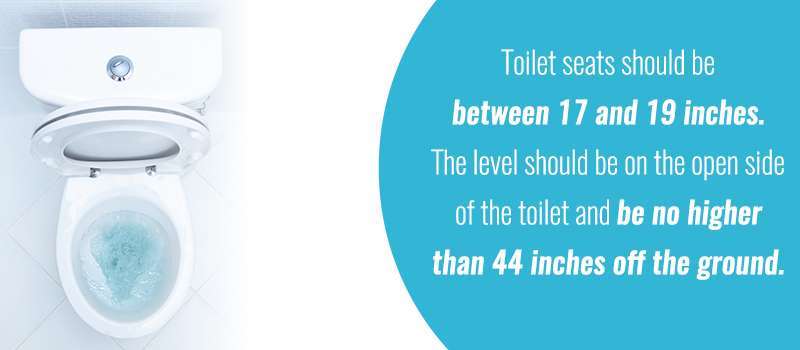
- Toilet Height. Toilet seats should be between 17 and 19 inches. The level should be on the open side of the toilet and be no higher than 44 inches off the ground.
- Hand Dryers. Hand dryers should be touch free and should not protrude more than four inches from the wall.
Why Regular Cleaning Is Essential
There is one particular maintenance issue that is crucial for anyone looking to keep a small commercial bathroom feeling comfortable. You must be diligent with cleaning. Regular cleaning is a must no matter how big your bathroom is. In a small bathroom, things like paper towels on the floor or a clogged sink are magnified. People don’t want to dodge trash, and, if you have a limited number of sinks, they will be put off by having one unavailable.
If you have committed to placing as many reflective surfaces as possible throughout the bathroom, you need to make sure they aren’t smudged or appear dirty. Fingerprints and other smudges will be more obvious if your surfaces are reflective. Besides, considering how much a company is judged by the condition of its bathroom, staying on top of cleaning is simply best practice, whether you have a small bathroom or not.
Who to Partner With for a Small Commercial Bathroom Design
Now that you are ready to tackle the design process for a small commercial restroom, you need to make sure you have a partner you can trust.
That’s where One Point Partitions comes in. For a decade, we have been providing quality American-made stalls and commercial bathroom partitions along with expert design consultations. With a wide range of finishes and design options, we have the versatility to help you meet your specific design needs.
Choose from five different partition materials: powder-coated steel, laminate, solid plastic, phenolic and stainless steel. As we noted, a high-gloss or steel finish material is especially well-suited for smaller bathrooms. The powder-coated steel option comes in a wide range of highly reflective colors, giving you plenty of design options!
To get started, we have a handy online layout tool that will let you play around with potential layouts for your restroom. Simple to use, it will give you a chance to see what your bathroom could look like quickly.
But, if you are still no quite sure how to proceed, we are eager to do what we can to help you with your design. That’s why we offer free design consultations and mock-ups! Plus, we offer free samples to give you a clear picture of our high-quality materials.
Whether you are just starting to plan a new construction, you have a bathroom redesign in your future or you want to make a few tweaks to make your bathroom seem more spacious, contact us today and discover how One Point Partitions can help you make a great impression on your customers, employees or guests!


