How to Choose the Right Colors for a Commercial Bathroom
A bathroom is a simple necessity in your commercial space. However, the way you decorate the space can affect how people perceive your business. Tailoring your bathroom décor to your preferred aesthetic helps you craft a positive impression.
Learn how to choose bathroom paint colors, what the best colors are for public bathrooms, and factors that can affect your commercial bathroom color schemes.
The Importance of Color Scheme in Commercial Restrooms
Public restroom design is a multi-faceted endeavor. Depending on your restroom’s location and expected traffic, your restroom color scheme must strike a balance between aesthetics and functionality.
A commercial bathroom’s color scheme can help promote the energy you want in your business or public space. An office restroom may incorporate neutral, calming colors, while a retail space or restaurant may use bright colors to energize customers.
From a functional standpoint, a restroom’s color scheme should also consider cleanliness and wear. For example, high-traffic restrooms in schools, stadiums, or outdoor recreation areas may benefit from lighter colors that show less wear and dirt.
Tips for Choosing the Right Paint Color For Your Commercial Bathroom
Selecting the perfect paint color is key. But what are the best colors for bathrooms from which you can choose? Follow these tips to choose the right commercial bathroom colors for your business.
Consider Your Branding Colors
A commercial restroom in a restaurant, retail shop, or other business space presents a unique branding opportunity. Incorporating your company’s branding colors into your overall décor subtly reinforces your brand identity and encourages brand recognition.
Brand representation may also include incorporating certain colors or designs that speak to your customer base.
Deep, rich colors may promote a sense of wealth and luxury. Bright colors and patterns may be more appealing for a preschool or pediatrician but may be inappropriate for an oncologist’s office.
Make Sure You Use the Right Materials
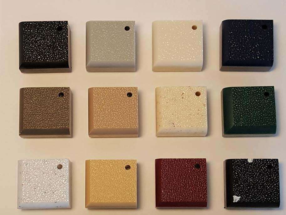
Commercial bathroom partitions come in a variety of materials, colors, and finishes. The right material can help foster user comfort and ease of use while maintaining your professional aesthetic.
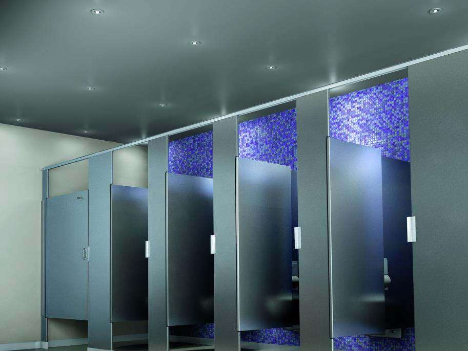
For instance, you may choose a sleek, modern, stainless-steel partition for a modern law office. On the other hand, a public restroom in a busy retail establishment may benefit from lighter, more resilient powder-coated steel or solid plastic in vibrant colors.
Materials for partitions, fixtures, counters, and other surfaces also serve a functional purpose. Stainless steel may present a sleek appearance, but dents or scratches can become apparent with hard use. A laminate material may offer patterns, such as wood, marble, and metallic finishes, but it may not withstand outdoor conditions with high water exposure.
Accentuate and Be Subtle, Don’t Overdo It
Although you may be tempted to incorporate a variety of vivid colors into your commercial bathroom, upkeep for bright colors can be challenging. Rather than using vibrant colors for the whole bathroom, consider using neutral colors that are easier to clean and maintain. Accent with bright colors that promote your desired brand aesthetic.
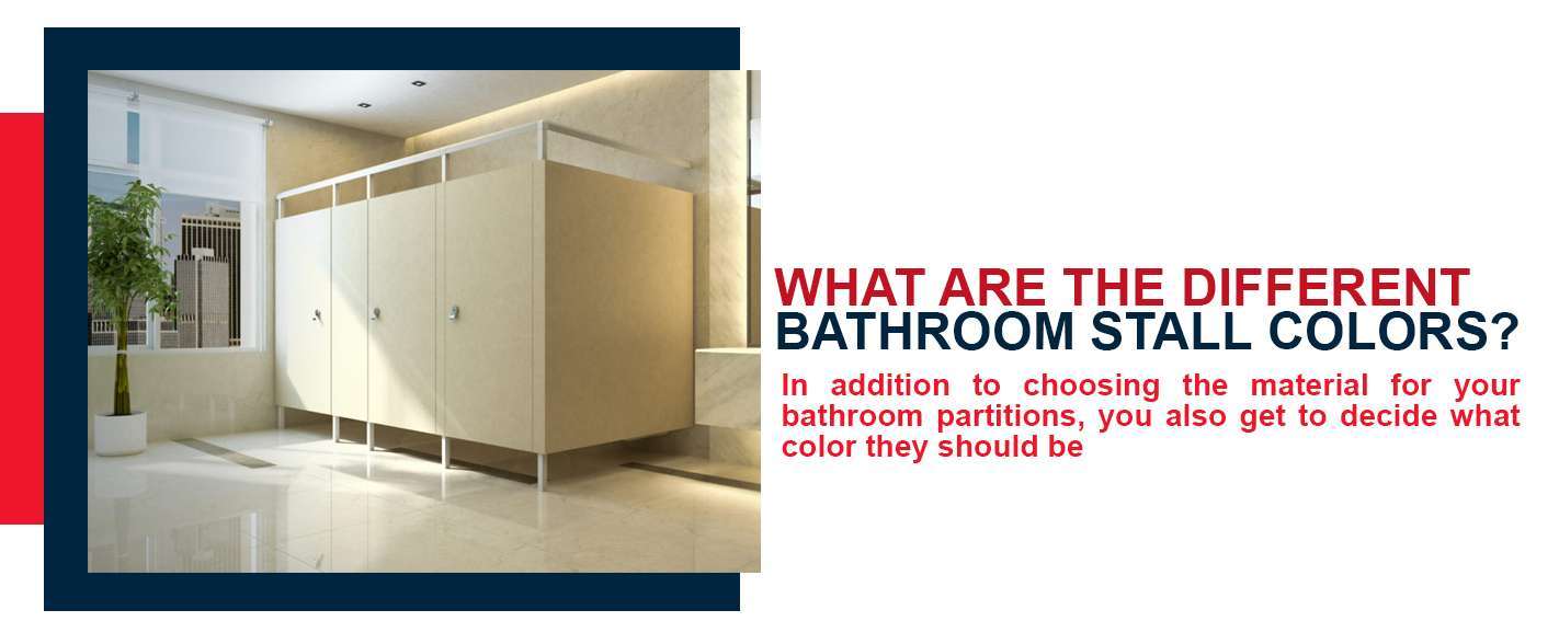
When choosing where to place your accents, consider where traffic will be the highest and what type of upkeep and maintenance will be necessary. For instance, you may use colorful accents or patterns on the walls and counters but decide to keep the floors and bathroom stall colors neutral for easy cleaning.
Go For a Comfortable Feeling or Ambiance
Comfort is a critical consideration in bathroom design. Dingy or stark colors can make customers feel as though they are in a hospital or institution. Similarly, dark colors without relief can make a bathroom seem uncomfortably small.
Consider color psychology and your desired ambiance when determining the best colors for your commercial restroom. Promote a relaxed feel with calming blues, greens, and yellows. For a more energetic environment, go with reds, oranges, and earth tones.
Remember the Bathroom Needs To Be Cleaned
Cleanliness is a primary functional concern for any commercial bathroom design. Customers will remember if your bathroom looks old, dingy, or dirty. Avoid leaving a negative impression by choosing easy-to-clean colors, materials, and surfaces.
You may benefit from light-colored or neutral partitions in high-traffic facilities like shopping malls, schools, or movie theaters. Dark colors may hide dirt in outdoor or park facilities, where dirt may be kicked up.
Your partitions, counters, and other surfaces should use materials that are compatible with your intended cleaning practices. Some materials do not react well to certain cleaning agents. Others may not react well to high moisture from power washing or other commercial cleaning practices.
Consider the Customer Experience
When considering your commercial bathroom design, remember the customer’s experience while in the restroom. Customers value privacy, cleanliness, and ease of use. Verify that your bathroom partitions open and close easily and provide sufficient privacy. Avoid using partition colors and patterns that may be too bright or uncomfortable to look at.
Confirm that the partitions provide enough space for customers to use counters, sinks, and hand dryers comfortably. Consider the client’s line of sight from the mirror, while washing and drying hands, and while entering or exiting the bathroom. You can add bright or patterned accents where they will be readily visible but not intrusive.
Let One Point Partitions Help You
Whether you are installing new public restrooms or revamping an existing space, your commercial bathroom provides a unique opportunity to reach your customers. A public restroom’s color scheme can create a mood, establish brand identity, and ensure a comfortable experience for your customers.
Contact One Point Partitions today to discuss how to choose a bathroom paint color for your commercial space.


